

How the Right CTA Can Turn Website Visitors Into Enquiries
.webp)
CONTENTS
- 20 CTA Button Examples
- Why are CTAs are so important?
- Where to put CTAs on your website?
- Choosing the right CTA for your website
- More contact options
- CTA examples for different businesses
A good website shouldn’t leave people wondering what to do next.
Once someone has looked through your services, seen your work or decided they’re interested in your business, there should be a clear next step.
That’s where your call-to-action (CTA) comes in.
A CTA is usually a button or link that encourages someone to take an action, such as requesting a quote, booking an appointment, making a purchase or getting in touch.
Don’t make an interested customer work harder than they need to.
20 CTA Button Examples
The best CTA depends on your business and what you actually want people to do.
Here are 20 common examples:
- Get a Free Quote
- Request a Quote
- Enquire Now
- Get Started
- Book a Consultation
- Book an Appointment
- Book a Call
- Check Availability
- Start Your Project
- Discuss Your Project
- Tell Us About Your Project
- Talk to Our Team
- Work With Us
- Request a Consultation
- View Our Services
- Explore Our Projects
- View Our Work
- Shop Now
- Book Now
- Contact Our Team
Try to avoid vague buttons such as Click Here or Learn More when you can be more specific.
Someone should know exactly what will happen when they click your button.
Why Are CTAs So Important?
A strong CTA helps turn interest into action. Someone who is already considering your business is much more valuable than a random website visitor. Giving them an obvious way to request a quote, make a booking or send an enquiry makes it easier for that interest to turn into an actual lead.
If someone has just looked through your completed projects and likes what they see, give them a Discuss Your Project button.
If they’ve read about your services and want pricing, give them Request a Quote.
If they’re ready to make an appointment, give them Book Now.
The easier you make that next step, the less effort it takes for someone to become an enquiry or customer.
And it’s something Google considers important too. In research commissioned by Google, Accenture Interactive assessed more than 100 high-traffic mobile websites across Australia and New Zealand. One of the five key areas assessed was how clear the website’s presentation and calls-to-action were.

Where Should You Put CTAs on Your Website?
Your CTA shouldn’t only appear once in your navigation.
Think about where someone is likely to be ready to take action as they move through your website.
Good places include:
- Your main landing section
- After your services
- Under your projects or portfolio
- After testimonials
- At the bottom of important pages
That doesn’t mean putting a Get a Quote button after every paragraph.
Give people the information they need, build their interest and provide a clear next step when it makes sense.
Choosing the Right CTA
Where your button takes someone is just as important as what the button says.
Get a Free Quote should take them directly to your quote form.
Call Us should let them call you immediately, especially on mobile.
Book an Appointment should open your booking system.
View Our Work should take them straight to your portfolio or projects.
And if someone clicks Enquire Now, don’t make them complete an unnecessarily long form just to speak to you.
The same Google and Accenture research also looked at registration and conversion, specifically considering whether completing a form was simple and safe.
What This Looks Like
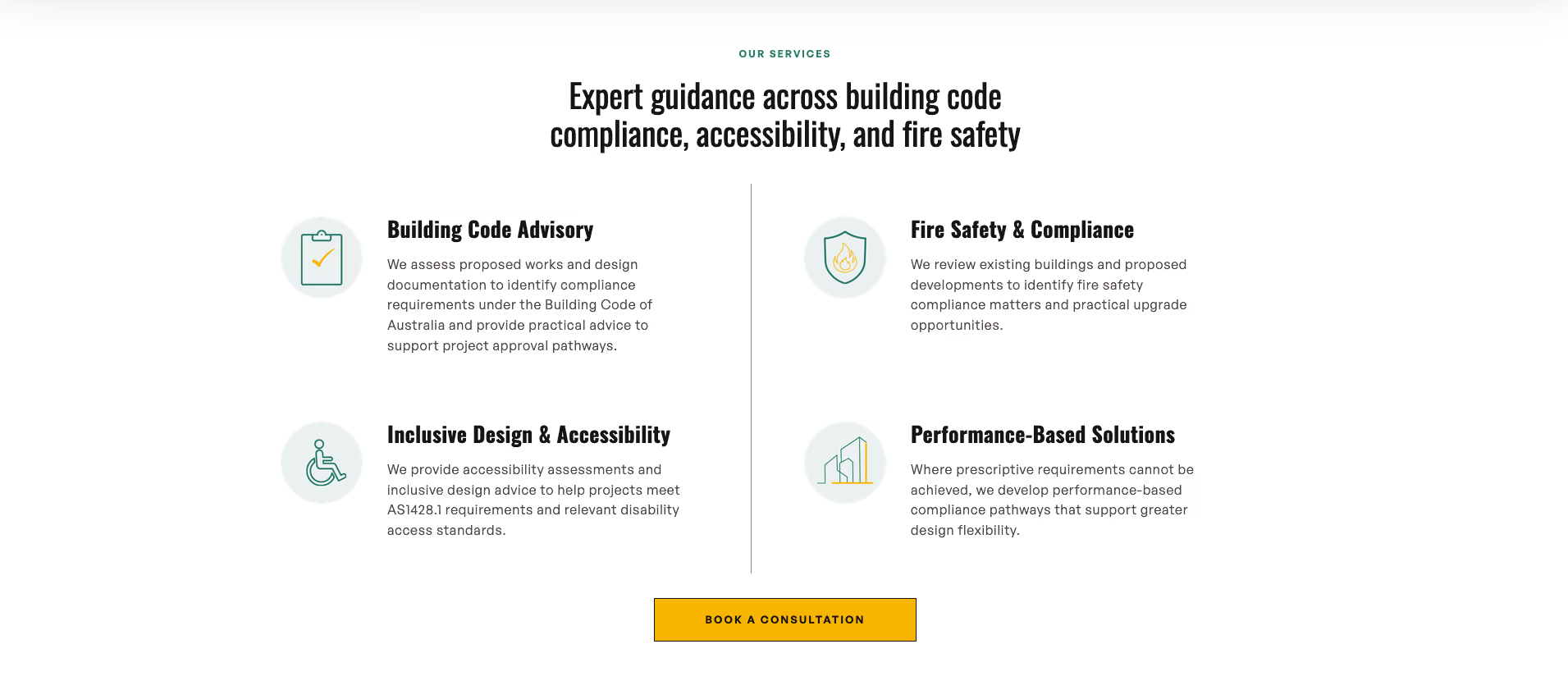
Tricode Consulting: Book a Consultation makes the next step simple, providing potential clients with a clear way to start the conversation.
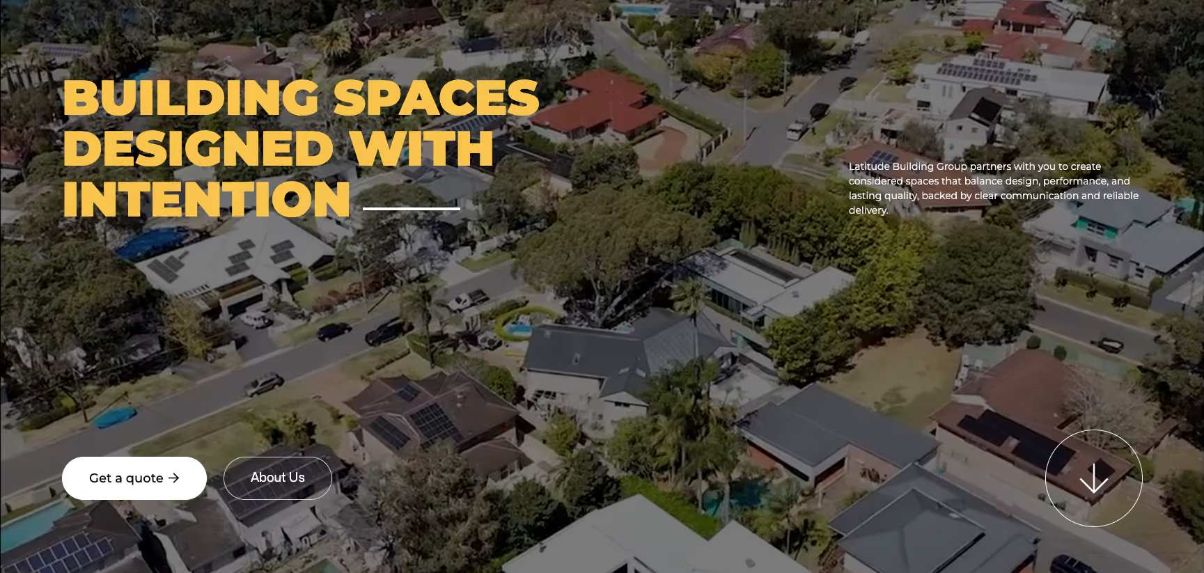
Latitude Building Group: 'Get a Quote' directs customers to enquire about their project, while 'About Us' gives them the option to learn more about the people behind the business and build a human connection first.
Think about what the natural next step is for your customer, and make that your CTA.
Every Page Needs a Next Step
Go through each page on your website and review: What do you want someone to do after reading this?
Someone reaches the end of your services page. Where should they go?
Someone finishes looking at a project. What should they do next?
Someone reads your testimonials and decides they trust you. How do they enquire?
Someone reaches the bottom of your homepage. Where are you sending them?
Every page doesn’t need the same CTA, but every page should have a purpose and a logical next step.
Give Customers More Than One Way to Contact You
Not everyone wants to contact a business the same way. Some people would rather pick up the phone, others prefer email, and some just want to fill out a quick enquiry form.
Where it makes sense, give potential customers a few clear options:
- Clickable phone number (mobile responsive)
- Clickable email address
- Enquiry or quote form
- Contact buttons throughout the website
- Online booking link, if relevant
The goal is to make contacting your business as easy as possible, no matter how someone prefers to get in touch.
We cover this in more detail in our How to Get More Enquiries Through Your Website guide.
CTA Examples for Different Businesses
The best CTA depends heavily on the type of business and what a new customer usually needs to do before working with you.
Builders & Construction Companies
- Request a Quote
- Discuss Your Project
- Start Your Project
- Request a Consultation
- Enquire About Your Build
Hairdressers & Beauty Businesses
- Book an Appointment
- Book Online
- Check Availability
- View Our Services
- Make a Booking
Consultants & Professional Services
- Book a Consultation
- Schedule a Call
- Talk to Our Team
- Discuss Your Needs
- Get Started
Allied Health & Healthcare Businesses
- Book an Appointment
- Book Online
- Contact the Clinic
- View Our Services
- Make an Enquiry
Online Stores
- Shop Now
- Add to Cart
- View Collection
- Explore New Arrivals
- Buy Now
Trades & Local Services
- Get a Free Quote
- Request a Quote
- Call Now
- Check Availability
- Book a Service
The wording doesn’t need to be clever. It needs to be clear.
Want More Enquiries Through Your Website?
Calls-to-action are only one part of a website that generates enquiries.
Your website design, content, mobile experience, trust signals, previous work and contact process all play a role in whether someone decides to contact your business.
If your website is getting visitors but they aren’t turning into enquiries, it may be time to look at how your website is guiding people towards that next step.
.avif)
When it comes to websites, I like to keep things pretty simple. I don’t think getting a good website should be confusing or overly complicated, and I definitely don’t think you need to understand all the web jargon to get one.
I’m always learning, always designing, and constantly finding new things that inspire what I do.
.avif)